- About
- Programs
- View all programs
- Swiss Professional Degree (ES)
- Bachelor of Arts in International Hospitality Management
- Master of Arts in International Hospitality Business Management
- Master of Arts in International Hospitality Business Management: Luxury Brand Management
- Master of Science in International Hospitality Management
- Master of Arts in Executive Hospitality Management (online)
- Postgraduate Diploma in International Hotel, Resort, and Spa Management
- Campus life
- Career Services
- Admissions
- News & Events
- Alumni
Luxury Hotel Room Colors That Define Elegant Design
Explore luxury hotel room colors, from timeless neutrals to rich jewel tones, and learn how color choices shape comfort, mood, and elegance.
Key Takeaways
- Luxury hotel room palettes most often are timeless neutrals, earthy and botanical tones, deep jewel accents, calming blues and greens, metallics with dark shades, or muted pastels.
- Color directions carry different psychological cues, with neutrals supporting visual calm, earthy tones reinforcing grounded comfort, blues and greens supporting rest, and jewel or metallic accents signalling richness when used selectively.
- Choosing a luxury hotel room color palette is strategic and typically depends on brand positioning, guest expectations, location context, cohesion across room categories, and long-term relevance.
- Hospitality education and professional training equip future leaders to assess color decisions critically, connecting design choices to brand strategy and guest experience.
Two hotel rooms can offer the same size, amenities, and service standards, yet feel markedly different the moment a guest steps inside. One feels appropriate for its price point and positioning; the other feels slightly off, even if it is difficult to pinpoint why. In hospitality, these impressions matter because they influence satisfaction before the stay even truly begins.
Color psychology is one factor behind this difference. Across hospitality settings, color contributes to how rooms communicate comfort, quality, and intent. In luxury hotel rooms, these signals are especially consequential.
Luxury hotel room colors must support a sense of coherence between what is promised and what is experienced, reinforcing perceived quality without drawing attention to the design itself. When color decisions are misaligned, the room can feel inconsistent or underwhelming, even if every other element meets technical standards.
Best Luxury Hotel Room Colors
The categories below outline some of the most popular color directions used in luxury hotel rooms today. These choices are not prescriptive rules, but recurring patterns that reflect how color contributes to atmosphere and overall experience.
Timeless neutrals
Neutrals such as whites, creams, beiges, taupes, and soft greys form the foundation of many luxury hotel rooms because they communicate refinement without distraction. Rather than drawing attention to themselves, these tones create a sense of visual order, allowing materials, textures, and furnishings to carry the design narrative.
Neutral palettes are closely associated with cleanliness, openness, and restraint. They make rooms appear brighter and more spacious, while reducing visual clutter that can feel mentally taxing after travel. This preference is reflected in guest research. A study published in the PUSA Journal of Hospitality and Applied Sciences found that neutral colors were the most preferred option for guest rooms, selected by 44.5% of respondents. In luxury contexts, this preference aligns with expectations of calm, clarity, and understated quality.
Earthy and botanical tones
Start Your Journey in the World of Hospitality
Turn your passion into a rewarding international career
Earth-inspired colors such as terracotta, sage green, warm browns, clay, and muted ochres introduce a sense of groundedness and material honesty. These tones draw on associations with natural environments, helping rooms feel settled and intentional rather than overly polished.
Earthy palettes are particularly effective in boutique hotels, eco-conscious luxury properties, and resorts where connection to place matters. When paired with natural wood, stone, or woven textiles, these colors reinforce authenticity and warmth.
Research in environmental psychology suggests that softer, nature-linked tones support emotional regulation and mental clarity, which helps explain why guests respond positively to rooms that feel less synthetic and more rooted, especially in dense urban settings.
Deep jewel palettes
Emerald, sapphire, amethyst, ruby, and deep navy bring richness and visual depth to luxury interiors. These colors carry long-standing associations with wealth and rarity, reinforced by their connection to precious gemstones historically linked to status and value.
In hotel rooms, jewel tones are most effective when used selectively. Applied as upholstery, headboards, curtains, or feature elements, they introduce contrast and focus without dominating the space. This controlled use creates visual weight and a sense of intention, allowing the room to feel luxurious rather than theatrical. The impact comes from balance, where richness is suggested rather than overstated.
Calming blues and greens
Soft blues, aquas, teals, and pale greens are widely used in luxury hotel rooms designed around rest and recovery. These colors are closely associated with water, sky, and vegetation, which contributes to their calming effect.
Studies in color psychology link blues and greens with lower stress responses and reduced anxiety, making them especially suitable for resorts, spa-focused hotels, and waterfront properties. In these contexts, color reinforces the setting. A pale aqua suite near the coast, for example, strengthens the sense of escape by aligning the interior with the surrounding environment rather than competing with it.
Metallic accents and dark shades
Metallic finishes such as gold, brass, and bronze, combined with darker tones like charcoal or deep slate, introduce contrast and definition. In luxury hotel rooms, these elements signal precision and contemporary refinement.
Used sparingly, metallics catch and reflect light, adding depth and variation to otherwise restrained palettes. Dark shades provide visual grounding, preventing rooms from feeling overly light or impersonal. This approach is common in urban luxury hotels, where contrast and structure help interiors feel composed and intentional rather than flat.
Muted pastels and pinks
Muted pastels, including blush, dusty rose, soft lavender, and pale peach, offer warmth without tipping into sentimentality. In luxury contexts, these tones soften interiors while maintaining sophistication, particularly when paired with clean lines and natural materials.
These palettes are often seen in boutique hotels and European-style properties, as well as rooms designed for couples or special occasions. Their renewed presence in luxury hospitality reflects a broader shift away from stark minimalism toward spaces that feel more inviting, tactile, and emotionally comfortable, without relying on overt romantic cues.
The Role of Texture and Materials in Luxury Color Design
Color in interior design is not experienced in isolation. The same shade can feel markedly different depending on the surface it appears on, the way it catches light, as well as the material it is paired with. Texture, for instance, influences whether a color feels soft or stark, warm or cool, understated or pronounced.
Materials help introduce an added layer of depth and variation that flat color alone cannot provide. Wood surfaces manage to soften color through natural grain and tonal variation. They add warmth and a sense of ease. Stone and marble interact with color more crisply as they reflect light and bring structure as well as visual weight to a space. Textiles such as linen, wool, or silk absorb and diffuse color, creating layers that feel tactile and inviting rather than purely visual.
The interplay between hard and soft materials is particularly important in luxury settings. Contrast prevents uniform palettes from feeling monotonous and gives rooms a sense of balance. A neutral scheme that combines smooth stone, matte walls, different textiles, and natural wood avoids visual fatigue because each surface responds differently to light and shadow. The color remains consistent. However, the experience of it changes across the room.
This attention to material and texture is what separates thoughtful luxury design from generic execution. Understanding how surfaces modify color allows designers to create rooms that feel cohesive and intentional through the interaction of a wide variety of elements working together with the color choice.
Choose the Right Luxury Hotel Room Color Palette
All those seeking a career in luxury hospitality must understand that selecting a color palette is a strategic decision, more so than a decorative one. The palette must communicate the establishment's quality and values, and remain consistent across guest types and locations.
The following factors are commonly taken into account when selecting a color palette for luxury hotel rooms:
Brand positioning
Color should reinforce the luxury hotel branding. A heritage city hotel and a contemporary resort may share similar price points, but their palettes communicate different values. Deeper tones and restrained contrast often support tradition and continuity, while lighter palettes and natural finishes convey openness and ease. The palette should reflect the brand's identity rather than follow external trends.
Guest expectations
Different guest segments respond to different visual environments. Business travellers often prefer composed, restorative interiors, while leisure guests may gravitate toward warmth and softness. Family-oriented luxury properties benefit from palettes that feel welcoming without sacrificing refinement. Color choices that ignore guest intent can result in rooms that feel visually polished but emotionally misaligned.
Location and context
Color gains credibility when it feels appropriate to its surroundings. Desert environments support warmer, earth-based tones, while coastal locations naturally align with lighter and cooler references. Urban luxury settings often rely on higher contrast and more structured palettes. Applying a palette without adapting it to the place can make interiors feel imposed rather than considered.
Consistency across room categories
Cohesion is essential in luxury hospitality. Guests notice when color strategies shift dramatically between room types. Strong palettes allow variation through saturation, material pairing, or accent placement while maintaining a clear visual throughline throughout the property.
Long-term relevance
Trend-driven palettes date quickly and often require costly updates. Luxury hotels tend to rely on timeless foundations built around neutral or nature-linked tones, introducing flexibility through accents and furnishings that can evolve over time. This approach supports longevity while maintaining visual relevance.
Conclusion
For future hospitality professionals, understanding how to evaluate and apply color strategically is part of broader design literacy. It requires linking visual decisions to brand positioning, guest perception, and operational longevity, rather than treating design as a purely aesthetic exercise.
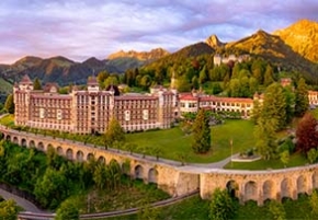
This perspective is embedded in the Bachelor of Arts in International Hospitality Management at Swiss Hotel Management School. Delivered across campuses in Caux and Leysin, the program combines hospitality-specific coursework, business fundamentals, and hands-on learning through internships. Students gain exposure to real operating environments where design decisions influence guest experience, brand consistency, and long-term performance.
In luxury hospitality, color is not a finishing touch. It is a strategic signal. Learning how to use it with intention is part of learning how to lead well-designed, well-positioned properties.
Frequently Asked Questions
What is the 80/20 color rule?
The 80/20 color rule is a design guideline where roughly 80% of a room uses a dominant, neutral color to create visual calm, while the remaining 20% is reserved for accent colors that add contrast and character. This balance introduces interest without overwhelming the space.
What is the three-color rule in interior design?
The three-color rule recommends selecting one dominant neutral, one secondary supporting tone, and one accent color to maintain visual harmony and prevent overwhelming spaces.
Which is the best color for a hotel logo?
The best color depends on brand positioning: blue conveys trust and calm, gold signals luxury, green suggests wellness, and deep neutrals communicate sophistication and timelessness.
Take the leap — discover your future in hospitality with Swiss Hotel Management School.


